Windows Phone 7 System Styles

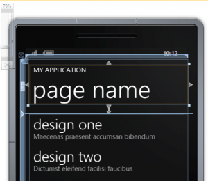
When you add a new page to your WP7 application project, the default XAML page is likely to contain references to style definitions such as PhoneTextNormalStyle and PhoneTextTitle1Style.

<!--TitlePanel contains the name of the application and page title-->
<StackPanel x:Name="TitlePanel" Grid.Row="0" Margin="12,17,0,28">
    <TextBlock x:Name="ApplicationTitle" Text="MY APPLICATION" Style="{StaticResource PhoneTextNormalStyle}"/>
    <TextBlock x:Name="PageTitle" Text="page name" Margin="9,-7,0,0" Style="{StaticResource PhoneTextTitle1Style}"/>
</StackPanel>

Those two style definitions are applied to the application title and page title of the page with the goal that all WP7 applications will share similar look.

Application Title and Page Title in WP7 Application

Just as you would use .NET libraries (as opposed to crafting your own wheels), you should use the built-in styles available. To discover more style definition that you can use, browse the file ThemeResources.xaml found in C:\Program Files (x86)\Microsoft SDKs\Windows Phone\v7.0\Design. Using these styles will guarantee that the application’s look will still be presentable when users change the color theme.
Edit Post Screen (Variant II)

I thought of this during the long wait at In-n-Out drive-thru (yes, it was good).

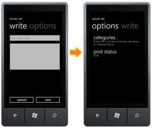
Utilizing the pivot control, I could place the writing area in one view and the auxiliary components (less used features) in another view. Which components are more or less used is up for pointless debate, though.

I can see how this is beneficial for the workflow of writing a blog post. When writing a post, I would normally start with a title and move on to writing the content. While writing, I’m focusing on writing and only writing. When I’m finished, I would set the categories. Writing the post content and setting the attributes of the post are two separate tasks in the post writing workflow; hence, the separation of the views.

Edit Post Screen with Pivot Control

The UI Design and Interaction Guide for Windows Phone 7 does not recommend pivot control for this kind of usage, however. The following are excerpts from the guide that the pivot control in Edit Post screen violates.

Pivot pages should not be used for task flow.

The pivot control should only be used to display items or data of similar type.

I understood why the first item of guideline is there. A task flow requires a strict order; user has to complete task one before proceeding to task two. Pivot control does not enforce that. User can navigate to views in pivot control in any order (except there is always one same initial view). This is less of an issue for this scenario. The big issue is that pivot control does not guarantee that a user will navigate to all views. I could click [save] and realize that I forgot to assign categories in the other view.

For the second item in the guideline. I could argue that I do use the control to display items of similar type: blog post’s properties of most used, and less used. But the author(s) of the guideline may disagree with that. Microsoft uses the email reader to show how a pivot control should be used. In the email reader, pivot control is used to display emails with status unread, flag, and the like in the different views.

Whether a pivot control is appropriate for the Edit Post screen, I need a usability testing to know if it will work for users.