Click the following button.

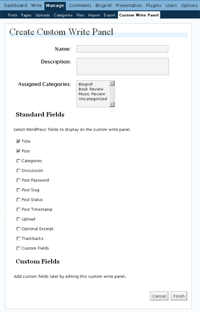
And you get this screen.

Click the following button.

And you get this screen.

I was reading this article and, man, did I do the right thing with Custom Field GUI?
I’m second guessing. No, I think it’ll better if I put the label above each control, instead of currently to the left of the control and right-aligned. Imagine, currently, those controls would shift to the left or right depending on the length of your labels; not the case when you have the label above the control. Hmm.
Also, don’t you think it’s better for the workflow if we can put those buttons (“Save and Continue Editing,” “Save,” and “Publish”) below the custom fields?
Users can write a Description for a custom write panel and for each custom fields associated with it. What do we do then with that information?
Say we want to incorporate them on the interface on the new custom write panel. Where will, precisely, the Description for a custom write panel fit in?
For the custom fields, I could imagine having that question-mark symbol to the right of the control and when users hover the mouse over them, the Description will show.